Copyright and other blogs currently being worked

ALCHEMY OF CLAY: Art and life connect! This fabric design is by Amanda Richardson - British fabric & textile artist in Penberth Valley, Land's End, Cornwall, England, UK

My info

Showing posts with label green glaze. Show all posts

Tuesday, April 25, 2017

Simplicity


A classic shape, medium size waiting for a bouquet. It has just 2 features worth noting that prove it was hand made. The emerald green has some deep blues flowing through it. And the maker's finger marks are along the bottom from when I dipped the whole vase into the green glaze. Well, there's also a great reflection of the photographer as well!

Today's Quote:


The most unrealistic person in the world is the cynic, not the dreamer. Hope only makes sense when it doesn’t make sense to be hopeful.
Paul Hawken

Sunday, February 19, 2017

Some yellows and greens, and glaze combinations

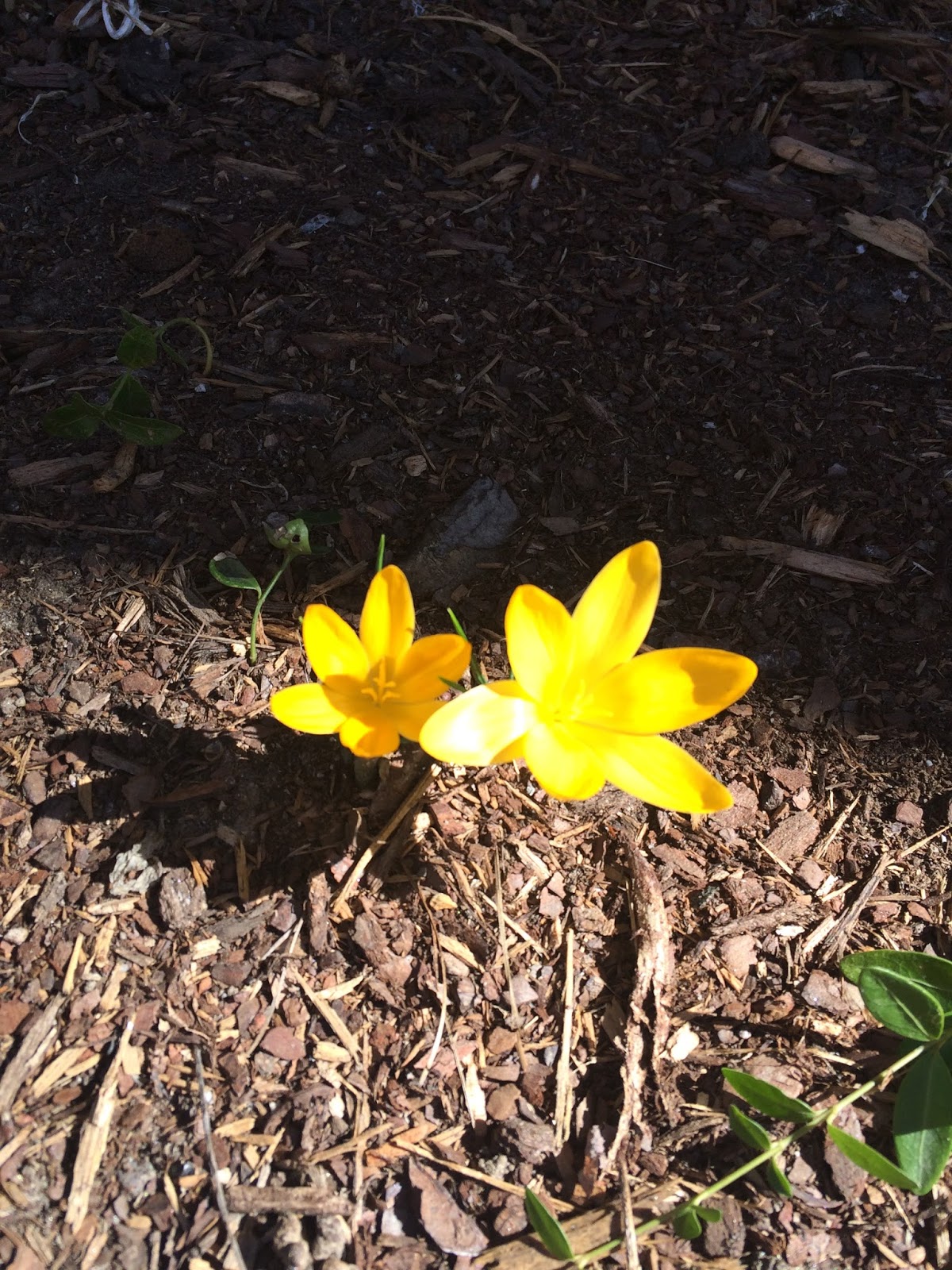
Sometimes a computer monitor has a setting whereby yellows and greens can get confusing, not to mention what a camera is able to convert into pixels.  So I'll start off with nature.
Crocus flowers in natural sunlight.
Even the camera is blown from capturing the paler yellow shades in sunlight, and they just blur into white petals.  This is an intense yellow going toward orange.


A couple more yellows in nature, which cameras just seem to hate.  The leaves in the bottom photo are a pale yellow green, and I think of them as chartreuse. I don't have a glaze that matches that color exactly.

This vase has two colors of leaves, 1) a light grass green, and the other 2) a yellow-green, which is close to a chartreuse, indoor and natural lighting. Note, the pinkish glaze for the flowers did all the fading in the kiln, it was supposed to be a bright purple-pink.

3) Butter Yellow glaze outside, with blue glaze inside, on white clay, indoor and natural lighting.

4) Celadon glaze on white clay, with natural lighting.

4) Celadon on white clay with indoor lighting.

5) Blue flower on white clay, indoor lighting. Yellow on bee and flower are Dandelion yellow.


6) Celadon glaze on Speckled Brownstone clay, natural lighting.

 4) Celadon on white clay, indoor lighting, with drips of plum glaze.

7) Matt Bronze Green on speckled brownstone, with turquoise leaves.  MBG glaze is not recommended for food.

 8) Turquoise glaze on speckled brownstone clay, indoor lighting

9) Glossy green glaze on bottom half, dipped again in white for the two mugs on left, dipped again in plum for the mug on the right, all on white clay, indoor lighting.

10) Matt bronze green on bottom, celadon in middle and interior,  then edge dipped in plum glazes, on white clay, indoor lighting.

9) Glossy green with white glaze over it. Leaves in turquoise. White clay.
9) exterior of same 4 inch small bowl, natural and indoor lighting.

OK, so when we talk about greens, there are so many variations, and yellows as well.  Please don't ask me to match a color.  I'd go crazy (except when I do some simple glaze like the Butter Yellow, which comes pre-mixed, and isn't a combination like a lot of my glazed pieces.) When painting flowers, bees, and lady bugs, most of the glaze requires three coats to be a clear color, which is why these take so much work.

Today's Quote:


"I feel that art has something to do with the achievement of stillness in the midst of chaos. A stillness which characterizes prayer, too, and the eye of the storm. I think that art has something to do with an arrest of attention in the midst of distraction."  Saul Bellow

Monday, November 5, 2012

Green Monday


 I want to focus on one of my favorite colors.  Green.  (Thanks Gary for the idea, since you've just put in 20 years getting  to the glaze combo that you were searching for...here)


I liked this combination (on a bowl that now belongs to someone else out there)  It's eggshell inside, and in the accents on the outside, with matt bronze green outside and on the rim.  I didn't do anything to make the great drips, either.

 Looking at this small bottle, all I can say is it didn't behave the way these glazes usually did, and I don't remember which ones it has on it.  Perhaps matt bronze green above, then celedon over the whole thing.  Usually our celedon is not blue however, so I'm not sure.\

This is the second one, same treatment...whatever it was.

This is one of my favorite glazes, which comes out in variations that don't always look the same.  Here moving toward antique green.  It's Matt bronze green sponged with amber.

 
Unfortunately our bucket of amber hasn't been used in a while and has settled into a solid several inches below the liquid.  I wonder if it will work at all again.


And this is my green moving to turquoise color...a dip into Mexico, then a dip into celedon. 


When used on a different clay, the matt bronze green will have the clay showing through, here either a raku clay  or perhaps dessert buff stoneware.  The orange spots are from wiping the glaze to a thin coat while still wet.

Thursday, October 4, 2012

test bowl

 What's so "test" about this bowl?
 I never get the glaze exactly horizontal where one glaze meets the next.  A new(ish) potter asked me how to do that, and I said I am unsuccessful at it.  And I actually usually like that so it proves a human hand and eye made this.

No, the test being carried out on the bowl here is that it has a rolled lip.  It may well have some air inside the roll, and I expected it wouldn't stay together.  But it did.  And it feels really nice, being light to handle though it looks very sturdy.

Get your cereal ready to eat in this!